Here are the main things you should remember from this guide to help you on your Figma website design journey.
Key Takeaways
- Start by setting up your Figma workspace and getting familiar with the basic tools and interface.
- Understand how to build website layouts using frames, and add essential elements like text and shapes.
- Learn to structure your designs logically, paying attention to spacing, alignment, and layer organization.
- Grasp the concepts of responsive design to make your websites look good on any device.
- Explore ways to speed up your workflow, like using UI kits, creating reusable components, and finding helpful plugins.
Getting Started With Figma Website Design

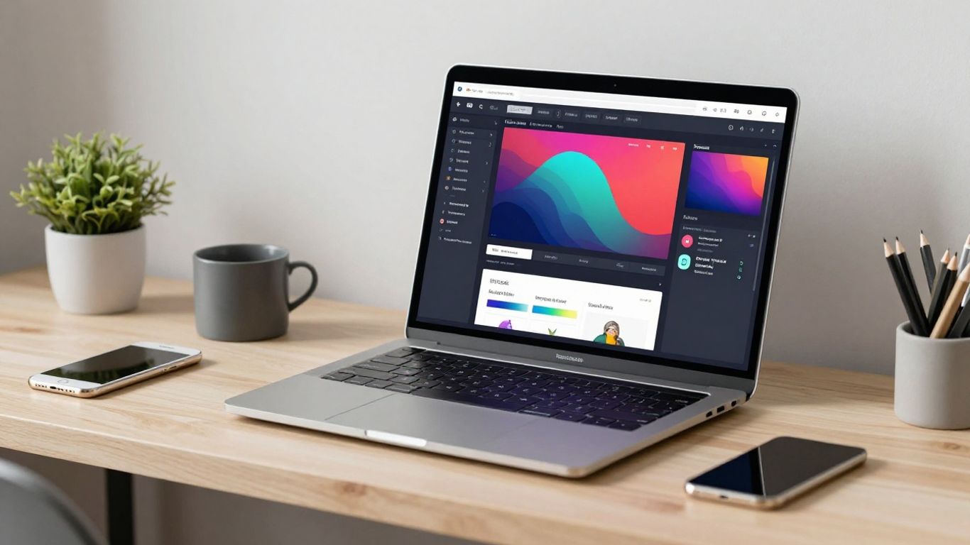
So, you want to design websites using Figma? That’s a great choice. Figma is a super popular tool for this kind of work, and for good reason. It’s all done in your web browser, which means you can jump in from pretty much any computer. No big software installs needed, just open it up and go. This section is all about getting you comfortable with the basics so you can start building your first web designs.
Setting Up Your Figma Workspace
First things first, let’s get your digital workspace ready. When you open Figma, you’ll see a dashboard. From here, you can create new files or open existing ones. For website design, you’ll be working with something called ‘Frames’. Think of these as your digital canvases, like the actual screen size of a desktop, tablet, or phone. Setting up your initial frames correctly is key to a smooth design process. You’ll want to get familiar with the file browser and how to organize your projects. It’s a good idea to start with a template or a blank file to get a feel for it. You can find some helpful resources to get you started, like this Figma Make Tutorial.
Understanding Core Figma Tools
Figma has a bunch of tools, but don’t let that overwhelm you. For website design, you’ll mostly use a few key ones to start. You’ve got your selection tool (the arrow), your shape tools (rectangles, ellipses, lines), the pen tool for custom shapes, and the text tool. Then there’s the frame tool, which is super important for web layouts. You’ll also get to know the layers panel, which is where everything you add to your design lives. It’s like a stack of papers, and you can reorder them.
Here’s a quick rundown of some tools you’ll use a lot:
- Frame Tool (F): Used to create artboards for different screen sizes.
- Shape Tools (R, O, L): For drawing rectangles, circles, and lines.
- Text Tool (T): To add all your written content.
- Pen Tool (P): For creating custom vector shapes.
- Move Tool (V): To select and move objects around.
Navigating The Figma Interface
When you open a design file, you’ll see a few main areas. On the left, there’s the layers panel, showing all your elements. On the right, you have the properties panel, which changes based on what you’ve selected – this is where you adjust colors, sizes, and other settings. The big central area is your canvas, where you’ll do all your designing. Up at the top, you’ll find the main toolbar with all the tools we just talked about. It might seem like a lot at first, but you’ll get the hang of it pretty quickly. Just remember to explore the different panels and see what they do. The 2026 web design course playlist is a good place to see the interface in action.
Getting comfortable with the Figma interface and its core tools is the first big step. Don’t try to learn everything at once. Focus on the tools you need for the task at hand, and you’ll build your skills gradually. It’s all about practice and getting familiar with the layout.
Foundational Elements Of Figma Website Design
Alright, so you’ve got your Figma workspace set up and you’re starting to get a feel for the tools. That’s awesome! Now, let’s talk about the building blocks of any good website design in Figma. Think of these as the essential ingredients you’ll be using over and over again.
Creating Layout Frames For Web Screens
First things first, you need a canvas for your website. In Figma, we use ‘Frames’ for this. They’re like digital artboards that represent different screen sizes. For web design, you’ll typically start with a desktop frame, but it’s smart to think about tablet and mobile sizes early on. You can find preset frame sizes in the Frame tool, or you can make your own. Choosing the right frame size is the first step to designing a website that looks good everywhere. It’s not just about picking a random size; it’s about setting up your digital space correctly from the get-go. You can explore some helpful Figma tutorials if you’re unsure where to start with frames.
Designing Navigation Headers
The header is usually the first thing a user sees, so it needs to be clear and functional. This is where your logo, site title, and main navigation links live. When designing a header, keep it simple. Think about what information is most important for users to find quickly. A common approach is to place the logo on the left and navigation links on the right, but there are many ways to do this. Consistency is key here; your header should look and behave the same across all pages of your site.
Adding Text, Shapes, And Visual Elements
Now for the fun part: adding the actual content! This involves using text layers for headings, paragraphs, and buttons, as well as shapes for backgrounds, dividers, and decorative elements. You’ll also be dropping in images and icons. Figma makes it easy to adjust colors, fonts, sizes, and spacing for all these elements. It’s all about combining these basic building blocks to create something visually appealing and easy to understand. Remember, good design isn’t just about looking pretty; it’s about making information accessible.
When you’re placing text and shapes, always think about the user’s journey. Does this element guide them? Is it easy to read? Does it make sense in the context of the page? These questions will help you make better design choices.
Here’s a quick rundown of common elements:
- Text: Headings (H1, H2, etc.), body copy, button labels, captions.
- Shapes: Rectangles (for buttons, cards, backgrounds), circles, lines (for dividers).
- Visuals: Images, icons, illustrations.
Getting these foundational pieces right will make the rest of your design process much smoother. It’s like laying a solid foundation before building a house. You wouldn’t want your walls to start crumbling, right? So, take your time with these basics. You can find more information on general design principles that apply here, even if they aren’t specifically about Figma. For example, understanding terms of service might seem unrelated, but it highlights the importance of clear rules and structure, which is also vital in design.
Structuring Your Website Layouts In Figma
Okay, so you’ve got your workspace set up and you’re starting to get a feel for the tools. Now it’s time to actually build something that looks like a website. This means thinking about how everything fits together, not just visually, but logically too. A good website structure is like a good blueprint for a house – it makes sure everything is in the right place and easy to find.
Building Website Sections Step-By-Step
Websites aren’t just one big blob of content. They’re broken down into distinct parts, like headers, footers, content blocks, and sidebars. In Figma, you’ll build these section by section. Start with the main container, maybe a frame for the whole page. Then, add frames for your header, your main content area, and your footer. Think of each frame as a box that holds specific content. You can then nest frames inside each other to organize things further. For example, within your main content area, you might have frames for different articles or product listings. This step-by-step approach helps keep things manageable.
Applying Spacing And Alignment For Clean UI
This is where things start to look polished. Spacing, often called whitespace, and alignment are super important. They guide the user’s eye and make the design feel less cluttered. Figma has tools to help with this. You can use grids and layout guides to keep things lined up. When you’re placing elements, pay attention to the space between them. Are the buttons evenly spaced from the text above them? Is the logo aligned with the navigation links? Consistent spacing and alignment make a design feel professional and easy to read. It’s not just about making it look pretty; it’s about making it functional.
Here’s a quick look at common spacing principles:
| Element Type | Recommended Spacing (px) |
|---|---|
| Text Lines | 1.5x Font Size |
| Sections | 40-80 |
| Buttons | 16-24 (around) |
Organizing Design Layers For Clarity
As your design grows, your layers panel can become a jungle. If you can’t find what you’re looking for, you’ll waste a ton of time. So, get into the habit of naming your layers properly from the start. Instead of ‘Rectangle 5’, call it ‘Hero Image Background’ or ‘Primary CTA Button’. Group related layers together into folders. For instance, all the elements that make up your navigation bar can go into a ‘Navigation’ group. This makes it much easier to select, move, or edit entire sections of your design. It’s also a lifesaver when you need to hand off your work to a developer, as they can easily understand the structure. A well-organized file is key to efficient website structure and collaboration.
Good layer organization isn’t just about tidiness; it’s about creating a system that makes your design process smoother and your final output clearer for everyone involved. Think of it as setting up your workspace so you can find your tools instantly.
Remember, building a solid layout in Figma is all about breaking down complex ideas into smaller, manageable parts and then arranging them thoughtfully. It’s a process that gets easier with practice, so keep at it! You can find some great examples of how to approach this in various Figma tutorials online.
Crafting Responsive Designs With Figma
Making a website look good on every device is super important these days. Nobody wants to pinch and zoom on their phone just to read a paragraph. Figma makes this whole process way less painful. You can actually build designs that flex and change based on the screen size, all within one project. This means you’re not designing three separate websites; you’re designing one smart website that knows how to behave on a desktop, a tablet, or a phone. It’s all about making sure your users have a good time, no matter how they’re looking at your site.
Designing For Desktop, Tablet, And Mobile
When you start a new project in Figma, it’s a good idea to set up frames for the different screen sizes you’re targeting right away. Think of these as your canvases for each device. You’ll want to consider the typical dimensions for each:
- Desktop: Usually wider, giving you more horizontal space. Think around 1440px or 1920px wide.
- Tablet: A middle ground, often in portrait or landscape. Common widths might be 768px or 1024px.
- Mobile: The smallest, with a focus on vertical scrolling. Standard widths are often 375px or 414px.
It’s not just about fitting content; it’s about how the content is prioritized and presented on each screen. For example, a complex navigation menu that works on desktop might need to become a simple ‘hamburger’ icon on mobile. You can start by designing the desktop version and then adapt it down, or vice-versa. Many designers find it easier to start with the smallest screen and build up, as it forces you to focus on the core content first. You can find some great examples of how to approach this by looking at actual UI files.
Using Constraints And Auto Layout
These two features are your best friends when it comes to making designs that adapt. Constraints tell elements how to behave when their parent frame is resized. For instance, you can tell a button to always stay pinned to the bottom right corner of its container. Auto Layout, on the other hand, is like a smart way to stack and space elements. You can set up rows, columns, and gaps that automatically adjust as you add or remove content. This is incredibly powerful for lists, cards, and navigation bars. When you use Auto Layout, your elements will naturally reflow and resize within their containers, making your designs much more flexible.
When you’re building out your layouts, think about how elements should relate to each other. Should they always be a fixed distance apart? Should they stretch to fill available space? Answering these questions will guide how you set up your constraints and auto layout properties.
Building Adaptable Layouts Across Screens
Figma Sites is a feature that really helps here, allowing you to build responsive webpages without needing separate designs for each device. The idea is to create flexible layouts that adjust on their own. You can use a combination of Auto Layout and Constraints to achieve this. For example, a section with three cards on desktop might stack into a single column on mobile, all managed by Auto Layout. You can test how your design looks at different sizes by resizing your frames or using Figma’s preview options. This approach makes your designs more robust and ready for the real world. It’s a much more efficient way to work than manually resizing elements for every single screen size. You can learn more about this by exploring Figma Sites.
Enhancing Your Figma Website Design Workflow
So, you’ve got the basics down and you’re building out your website designs in Figma. That’s awesome! But how do you stop reinventing the wheel and actually speed things up? This is where we talk about making your workflow smoother. It’s not just about drawing shapes; it’s about working smarter.
Leveraging UI Kits and Design Systems
Think of UI kits and design systems as your pre-built Lego sets for website design. Instead of crafting every single button, input field, or card from scratch every time, you can grab these pre-made elements. This saves a ton of time and, more importantly, keeps your designs consistent. A good UI kit has all the common elements you’ll need, styled and ready to go. Design systems go a step further, providing a whole library of components, styles, and guidelines that ensure everything looks and feels cohesive across your entire project, and even across multiple projects. It’s like having a style guide and a component library all rolled into one. You can find some really great ones out there, or even build your own as you go. Staying updated with the latest web design trends is easier when you have a solid system to implement them.
Creating Reusable Components
This is a big one. Components in Figma are like master templates. You create a button once, turn it into a component, and then you can use that component everywhere. Need to change the color of all your buttons? Just change the master component, and every instance of that button updates automatically. It’s a game-changer for managing large projects and making quick edits. You can create components for buttons, forms, navigation bars, cards, and pretty much anything you find yourself repeating. This makes your design file much cleaner and easier to manage. It’s a core part of building a scalable design process.
Exploring Figma Plugins for Efficiency
Figma’s power isn’t just in its core features; it’s also in its plugin ecosystem. There are plugins for almost anything you can imagine. Need to quickly add placeholder text or images? There’s a plugin for that. Want to check color contrast ratios? Yep, plugin. Need to generate charts or maps? You guessed it, a plugin. These little tools can shave minutes, or even hours, off your design tasks. Some popular ones help with organizing layers, exporting assets, or even generating code snippets. It’s worth spending some time browsing the Figma Community to see what’s out there. You might find a plugin that completely changes how you approach certain design challenges.
Working efficiently in Figma isn’t just about speed; it’s about building a repeatable and maintainable design process. Using components and plugins helps you focus more on the creative problem-solving and less on the repetitive tasks. Think of it as setting up your workshop so you can build things faster and better.
Here’s a quick look at how these can help:
- UI Kits/Design Systems: Speed up initial design, ensure brand consistency.
- Components: Allow for quick updates and maintain consistency across designs.
- Plugins: Automate repetitive tasks, add specialized functionality.
By integrating these practices, you’re not just designing; you’re building a robust and efficient design workflow that will serve you well, whether you’re working solo or as part of a larger team. It’s about making your design life easier, which, let’s be honest, is always a good thing. You might even find yourself looking for specialized help, much like choosing the right advertising agency, to ensure your design strategy is as effective as possible.
Bringing Your Figma Designs To Life
So, you’ve spent hours crafting these amazing website layouts in Figma. They look great on your screen, but how do you actually show them off or get them ready for someone else to build? That’s where this section comes in. We’re going to talk about making your static designs feel alive and ready for the real world.
Prototyping Simple Interactions
This is where your designs start to move! Prototyping in Figma lets you link screens together and add simple animations to show how a user would actually click through your website. Think about how a button should look when you hover over it, or what happens when you click a link. Figma makes this pretty straightforward.
Here’s a quick rundown of how to get started:
- Switch to Prototype Mode: You’ll see a tab on the right-hand sidebar. Click it.
- Connect Elements: Select an element (like a button) and you’ll see a little blue circle appear. Drag that circle to the screen you want it to link to.
- Define Interactions: A panel will pop up asking how the interaction should happen. You can choose things like ‘On Click’, ‘While Hovering’, and what kind of animation to use, like ‘Dissolve’ or ‘Smart Animate’.
- Preview: Hit the ‘Present’ button (the play icon) at the top to see your prototype in action. It’s like a mini-version of your website!
The goal here isn’t to build a fully functional website, but to demonstrate the user flow and key interactions. It helps everyone, including yourself, understand how the site is meant to work.
Refining Design Elements For Presentation
Before you show your work to clients or developers, you want it to look polished. This means tidying up any stray elements, making sure your spacing is consistent, and checking that all your colors and fonts are exactly as intended. It’s the final polish that makes a big difference.
Consider these points:
- Consistency Check: Go through each screen. Are your headings the same size and style? Are your buttons looking uniform?
- Visual Hierarchy: Does the most important information stand out? Is it easy for someone to scan the page and know what to look at first?
- Whitespace: Don’t be afraid of empty space. It helps guide the eye and makes your design feel less cluttered.
Sometimes, the simplest designs are the most effective. It’s easy to get caught up in adding lots of effects and animations, but often, a clean and clear presentation is what truly shines. Focus on clarity and purpose.
Preparing Designs For Development Handoff
This is the final step before your designs move from Figma to the actual coding stage. You need to make sure developers have all the information they need to build your website accurately. Figma has some built-in features to help with this, and there are also plugins that can make the process even smoother. You can even explore tools like Figma Make to help generate assets.
Here’s what developers typically need:
- Clear Specs: Figma automatically generates measurements (like spacing, size, and color codes) when a developer inspects an element. Make sure your layers are well-organized so they can find things easily.
- Assets: Any images, icons, or logos need to be exported in the correct format and resolution. You can select multiple items and export them all at once.
- Style Guide: If you’ve been using styles and components, this is where they really pay off. A developer can refer to your defined styles for colors, typography, and components to maintain consistency.
Getting this part right makes the development process much faster and reduces the chances of misinterpretation. It’s all about clear communication between design and development teams, and Figma provides a solid foundation for that. For more on efficient workflows, check out this beginner-friendly introduction.
Conclusion
So, that’s the rundown on getting started with Figma website design. It might seem like a lot at first, but honestly, the best way to learn is just to jump in and start clicking around. You’ll pick up the tools and tricks as you go. Remember, practice makes perfect, and with Figma, you’ve got a super powerful tool to bring your web ideas to life. Keep designing, keep learning, and don’t be afraid to experiment. Happy designing!
Frequently Asked Questions
What exactly is Figma?
Figma is a tool you use on your computer, usually through a web browser, to design how websites and apps will look. Think of it like digital graph paper but way smarter, letting you draw out screens, buttons, and all the other bits that make up a website.
Do I need to be a pro designer to use Figma?
Nope! Figma is made so that beginners can jump in and start creating. It has a lot of features, sure, but the basics are pretty easy to pick up. There are tons of guides, like this one, to help you out.
What’s the difference between designing for desktop and mobile?
Websites need to look good on big computer screens and small phone screens. Designing for desktop means making things look good on a wide view. Mobile design is about fitting everything neatly onto a smaller screen, often stacking things up so they’re easy to tap with a finger.
What are ‘components’ in Figma?
Components are like master copies of design elements, such as a button or a header. If you make a change to the master component, it updates everywhere you’ve used it. It saves a ton of time and keeps your design looking consistent.
How do I make my Figma design look good on different screen sizes?
Figma has tools called ‘Constraints’ and ‘Auto Layout’. Constraints tell elements how to behave when the screen size changes, like sticking to the top or stretching. Auto Layout helps arrange items in a row or column that can adapt automatically.
What happens after I finish my design in Figma?
Once your design is ready, you can show it off as a clickable prototype to see how it works. Then, you can share the design files with the people who will actually build the website, so they know exactly what to create.
Leave a Reply